Why I Built My Own Stock Performance Dashboard—and How It Made Me Smarter About Investing
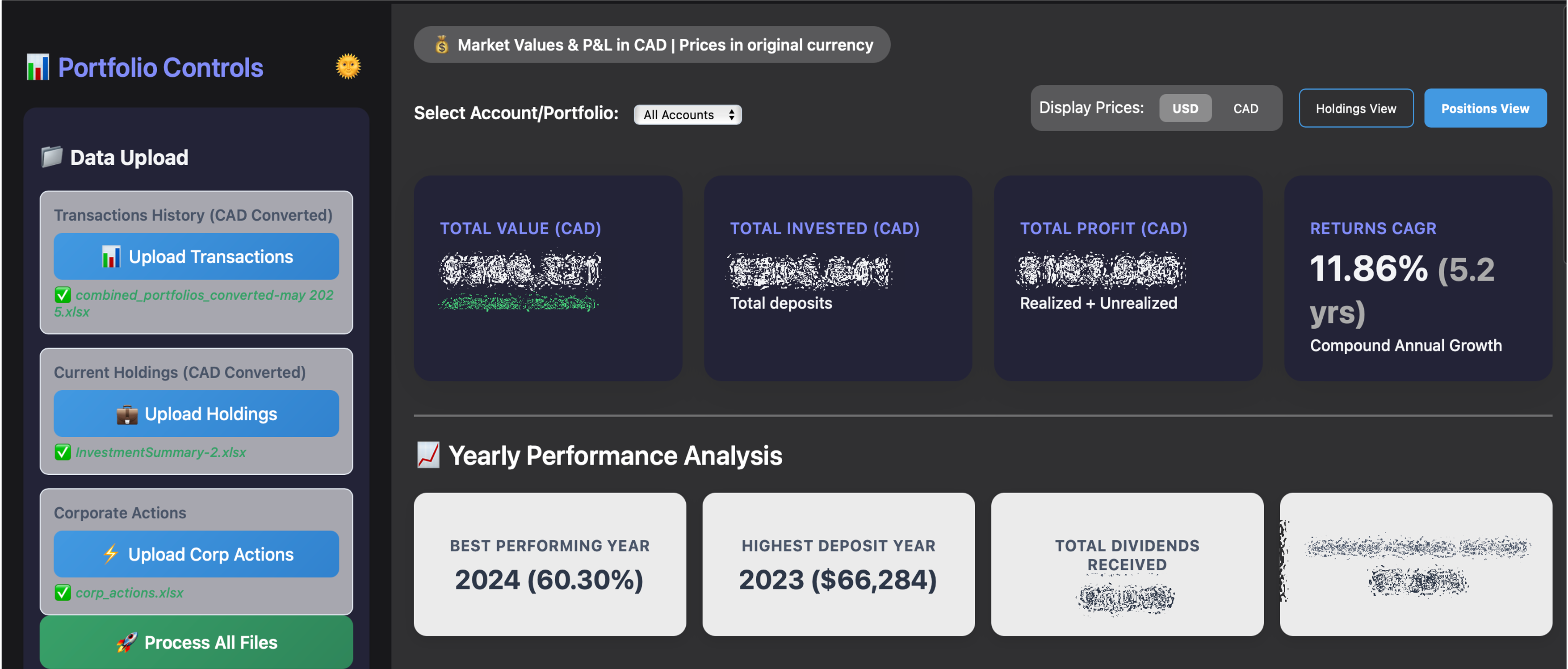 First impression matters: The dashboard's visual polish and instant KPI cards make your portfolio's story obvious at a glance. No more guessing—just clear, actionable numbers.
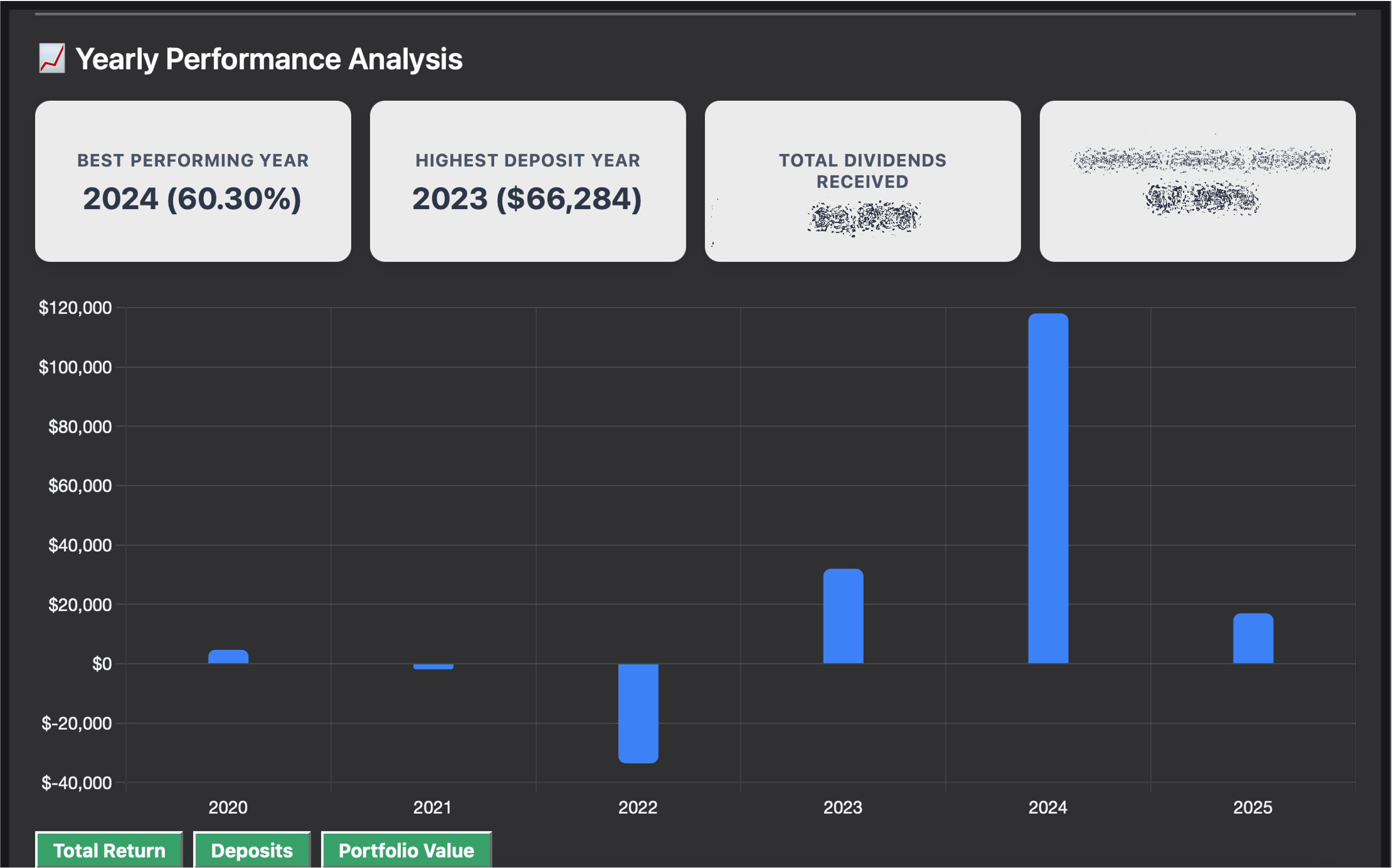 Yearly performance at a glance: No more Excel Jenga—just clear, actionable insights for every year. See exactly how your money grew (or where it didn't).
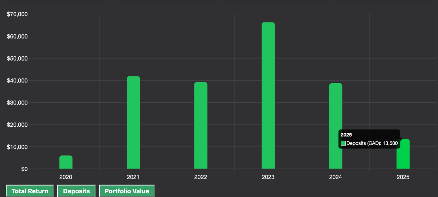 See your investing journey: Visualize your commitment and growth with annual deposit tracking. Because sometimes you need to remind yourself that you actually did invest that money.
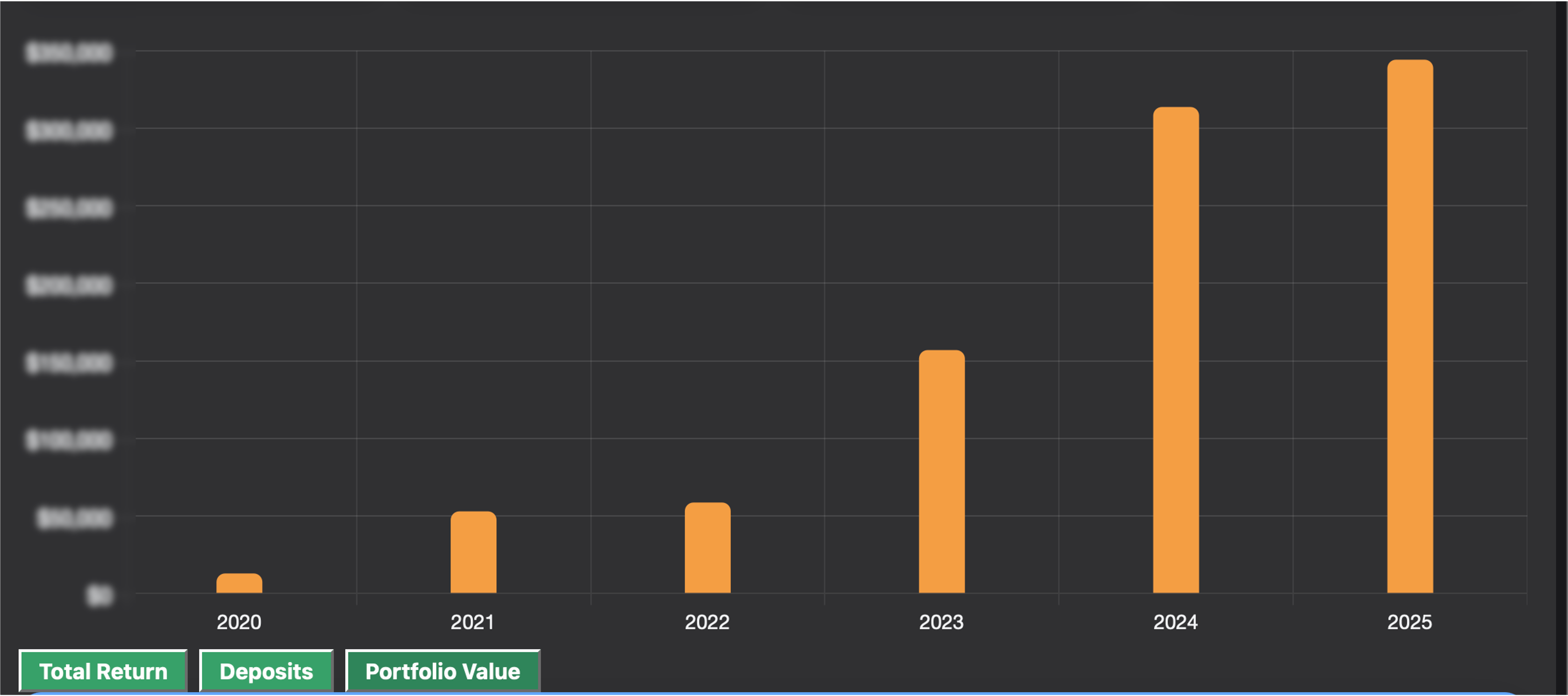 Portfolio value, visualized: Celebrate your progress and spot trends instantly. Because watching your money grow should feel good, not confusing.
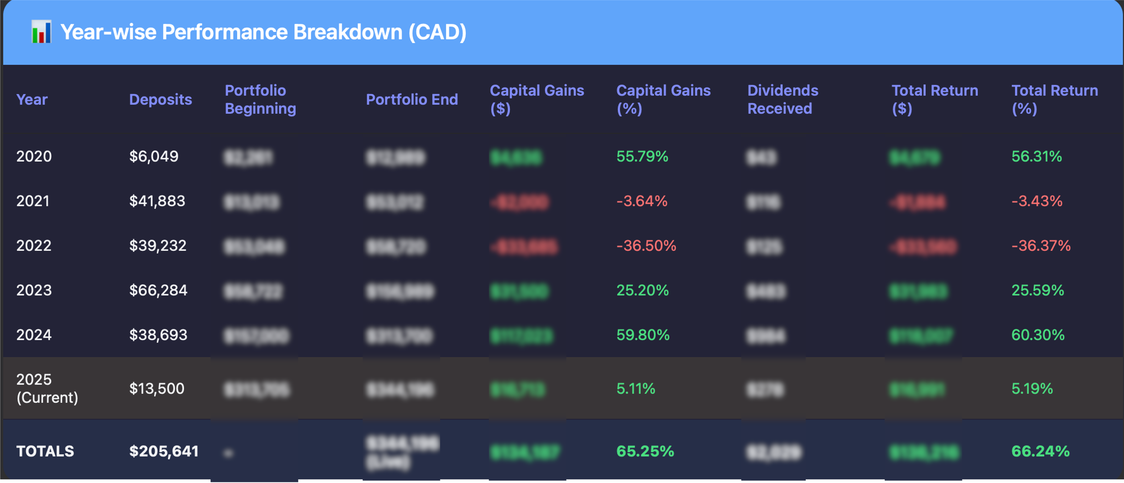 Every year tells a story: Detailed breakdowns show you exactly what worked, what didn't, and where to focus your attention next.
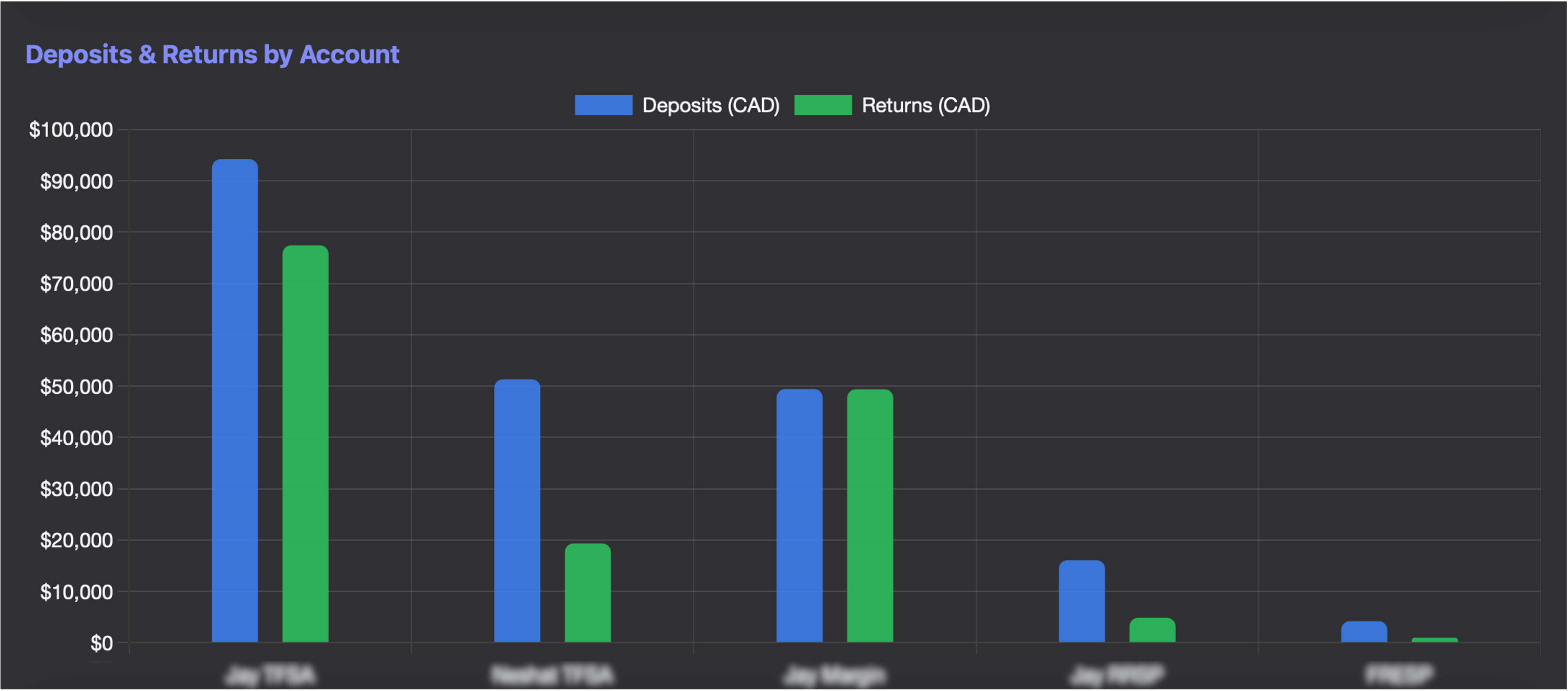 Every account, side by side: See which accounts are winning and where to focus next. Because not all accounts are created equal.
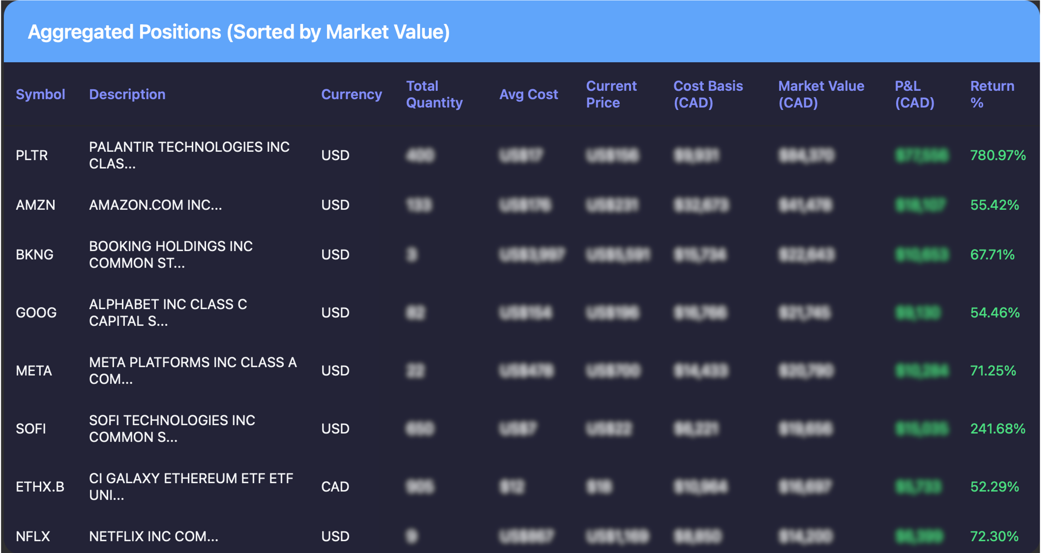 Your complete financial picture: Aggregated positions show you the forest, not just the trees. Perfect for spotting over-concentration or missed opportunities.
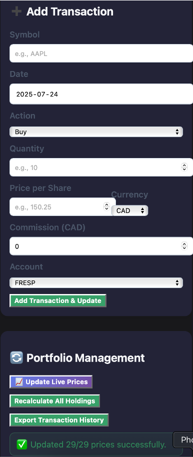 User-friendly and reliable: Enter anything manually, update prices live, and never miss a beat—even with edge cases! Because sometimes you need to fix what your broker got wrong.
"I Got Tired of Not Knowing How My Stocks Were Doing, So I Built This Dashboard to Fix It"
⸻
🧠 The Why (Problem)
Ever tried to check how your stock portfolio is actually doing and ended up playing Excel Jenga with 12 CSVs from your broker?
Yeah, same.
Most brokers give you:
- A confusing "performance" chart (that you think means profit, but really doesn't),
- No year-by-year returns,
- Zero clue what your actual deposits were,
- And definitely no easy way to see how much you've gained (or lost) after fees, currency conversions, and your cousin's hot tip on crypto mining stocks.
I wanted a clear, honest, and customizable dashboard—so I built one myself.
⸻
✨ What I Built
My custom dashboard shows:
- 📈 Yearly breakdowns of returns, deposits, and dividends
- 💼 Holdings vs. Positions view, sortable by market value
- 🧾 Manual transaction entry for buys, sells, dividends, deposits, and withdrawals
- 💱 Real-time CAD/USD exchange conversion
- 🔄 Live price updates with auto-refresh during market hours
- 🌗 Light/Dark mode toggle (because aesthetics matter too)
In short: it's the dashboard I wish my stock broker offered me (without the hidden fees and 'please hold' music).
⸻
😵 The Real Challenges I Faced (and How I Wrestled Them Into Submission)
This wasn't just a coding project. It was a war with messy data, stingy APIs, and annoying edge cases.
🪙 1. "Hey, can I get a reliable stock price?" —Me, to the Universe
Nope. Every free API I used:
- Rate limited me, or
- Gave me suspiciously wrong prices (yes, I'm looking at you, Alpha Vantage), or
- Was down on weekends when I finally had time to debug.
Solution: I created a failover system. If one API fails, the next one kicks in. Still flaky? I prompt for manual price entry. (Like a bartender asking, "How strong you want this?")
⸻
💵 2. USD vs. CAD — The Forex Fiasco
Most of my stocks were in USD, some in CAD. Some trades converted automatically, others didn't.
Solution:
- Auto-detection of currency based on file and symbol
- CAD conversion with live exchange rates (or manual override if you don't trust bots)
⸻
💸 3. Corporate Actions = Corporate Headaches
Stock splits and consolidations ruined my cost basis math. One share suddenly became ten, or vice versa, and my returns looked like I'd invested in magic beans.
Solution:
- Uploaded corporate actions file
- Wrote logic to recalculate quantity, price, and cost basis backward in time
- Adjusted holdings while keeping cost integrity intact (like forensic accounting for stocks)
⸻
🧾 4. Manual Entries Without Losing Sanity
Sometimes you just need to enter a dividend by hand. Or fix a typo. Or add a rogue GIC.
Solution:
- Intuitive form to add/edit any transaction
- Smart defaults and data validation
- Stored in localStorage and merged with uploads (dupes filtered automatically)
⸻
📊 5. Making It Look Beautiful (Without React or a Framework)
Vanilla HTML/CSS/JS can be clunky. But I wanted it lightweight, fast, and usable offline.
Solution:
- Wrote clean, modular JavaScript
- Designed responsive UI with dark mode, flexbox, and glassmorphism
- Used Chart.js for sexy visuals and interactivity
- No backend, no login, just open and go
⸻
🤯 What I Learned
This project taught me:
- UX matters even in personal tools—especially when you use them daily
- Debugging stock data is like untying knots blindfolded
- Your broker's dashboard probably hides useful metrics on purpose
But most of all, I realized:
If your tools don't serve you—build your own.
👨💻 For the Developers
- Frontend: HTML, CSS (Custom), JavaScript (no frameworks)
- Libraries: Chart.js, SheetJS
Features:
- Modular JS (functions scoped & reusable)
- Exchange rate logic (manual & auto)
- Live price fetch w/ failover from Yahoo → Alpha Vantage → Polygon → Finnhub
- DOM mutation tracking for dynamic updates
- Manual vs uploaded transaction merge via key hashing
- LocalStorage persistence
- Clean, responsive UI using flexbox + media queries